An ADA website compliance checklist turns WCAG 2.1 AA, the standard used in demand letters and settlements, into things you can check on your own store. If you’re not sure the ADA applies to you, read our guide to ADA website compliance for online stores first, then come back to this list.
There are 15 checks below, grouped the way a store is built: menus, product photos, colors, checkout, forms, keyboard, phones and video. Each one says how to check it with a browser, a keyboard and a free screen reader, and carries one of three labels:
- A scan checks this. An automated scan finds it in about a minute.
- A scan checks part of this. A scan finds some of it. The rest needs you.
- Check this yourself. Only a person can tell.
Each check also links to the WCAG success criterion behind it on the W3C website, in case you or your developer want the detail.
Clear the automated items first, so your time goes on the checks only a person can do.
Menus and navigation
1. A “Skip to content” link appears when you press Tab
Open your homepage, click the address bar, then press Tab once. A link like “Skip to content” should appear and jump straight past the menu when you press Enter. Without it, keyboard users tab through every menu item on every page.
Check this yourself.
WCAG 2.1: 2.4.1 Bypass Blocks

2. Every link and button has a name
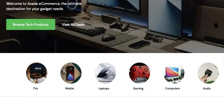
Icon links, image links and buttons need a text name a screen reader can read out. Otherwise it just says “link” or “button”. In our checks of popular theme demos, Avada’s six round category pictures were links with no name, and so were the six social icons in the GeneratePress Designer starter site’s footer, on every page.
A scan checks part of this: it finds links and buttons with no name at all. Read a few names yourself to make sure they make sense, because “Click here” passes a scan but tells nobody where it goes.
WCAG 2.1: 2.4.4 Link Purpose (In Context) and 4.1.2 Name, Role, Value
3. Each page has a clear title and the right language
Look at the browser tab on your homepage, a product page and the cart. Each should name the page and your store, like “Blue Linen Shirt | Your Store”. The page should also tell browsers it’s in English, so screen readers pronounce it correctly.
A scan checks part of this: it checks that the page language is set. Read the page titles yourself.
WCAG 2.1: 2.4.2 Page Titled and 3.1.1 Language of Page
Images and product photos
4. Every product photo has a description
Each product photo needs a short text description, called alt text, that says what a shopper would see: “Blue linen shirt, front view”, not “IMG_4032” or the product name repeated. Purely decorative images, like a background pattern, should have an empty description so screen readers skip them. Missing alt text turns up on 53.1% of the home pages WebAIM checks, and on a store it grows with every product you upload.
A scan checks part of this: it finds images with no description at all. Only you can tell whether a description is accurate and useful, so read a few on your best-selling products.
WCAG 2.1: 1.1.1 Non-text Content
5. Important words are text, not part of an image
Look at your banners and promotions. If “20% off this weekend” is baked into a picture, screen readers can’t read it, and it blurs when someone zooms in. Put the offer in real text on top of the image, or repeat it in the image’s description.
Check this yourself.
WCAG 2.1: 1.4.5 Images of Text
Colors and text
6. Text is dark enough against its background
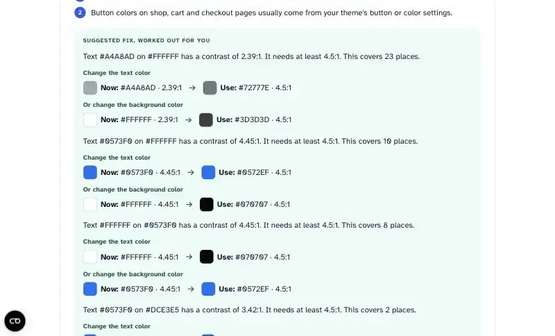
Normal text needs a contrast ratio of at least 4.5:1 against its background, and large text (roughly 24px, or 19px bold) at least 3:1. That includes prices, buttons, links and the grey “small print” many themes love. It’s the most common failure on the web: low contrast text shows up on 83.9% of the home pages WebAIM checks. It can miss by a hair. In our checks of popular theme demos, Astra’s default blue, #0573F0, measured 4.45:1 against white, just under the minimum.
A scan checks this. A good report also suggests the closest colors that pass, so your design barely changes.
WCAG 2.1: 1.4.3 Contrast (Minimum)
7. Color is never the only signal
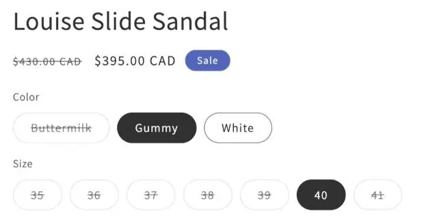
Check anything that relies on color alone: a sale price shown only in red, sold-out sizes that are only greyed out, a required field marked only by a red border. Some shoppers can’t tell red from green, and screen readers don’t announce color at all. Add a word, a line through, or an icon with a label.
Check this yourself.
WCAG 2.1: 1.4.1 Use of Color
Product options, cart and checkout
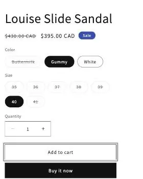
8. Size and color options say what they are, including sold-out ones
Turn on a screen reader (VoiceOver on a Mac with Command + F5, or the free NVDA on Windows) and move through the options on one product page. Each should be announced with its name, like “Size: Medium”, and a sold-out option should say it’s unavailable, not just look crossed out. In our checks of popular theme demos, Shopify’s Dawn theme got this right: sold-out sizes are announced to screen reader users.
A scan checks part of this: it finds option menus with no label. Whether sold-out options are announced needs a person with a screen reader.
WCAG 2.1: 4.1.2 Name, Role, Value
9. Checkout errors say what went wrong, in words
Go to your checkout, leave the email field empty, type a broken card number, and try to continue. Each error should say in words which field is wrong and how to fix it, like “Enter an email address”. A red border on its own doesn’t tell a screen reader user anything. On most platforms, checkout comes from the platform or a payment app, so test it anyway: it’s the one page where a problem costs you the sale.
Check this yourself.
WCAG 2.1: 3.3.1 Error Identification
Forms
10. Every form field has a visible label
Check your newsletter signup, contact form, account login and checkout. Every field needs a label that stays visible while you type. Grey placeholder text inside the box, like “Your email”, disappears as soon as someone starts typing, so it isn’t enough on its own. Missing form labels turn up on 51% of the home pages WebAIM checks.
A scan checks part of this: it finds fields that have no label at all. A field labeled only by placeholder text can pass a scan, so look at your forms yourself.
WCAG 2.1: 1.3.1 Info and Relationships and 3.3.2 Labels or Instructions

Keyboard
11. You can buy something using only the keyboard
Put your mouse aside. Starting on your homepage, use Tab to move forward, Shift + Tab to go back, Enter to follow links and the arrow keys in menus. Go all the way: find a product, choose a size, add it to the cart and reach checkout. You should never get stuck somewhere you can’t Tab out of, and focus should move in a sensible order down the page. In our checks of popular theme demos, keyboard users had to press Tab 20 times to get past Impact’s announcement bar and reach the main menu.
Check this yourself.
WCAG 2.1: 2.1.1 Keyboard, 2.1.2 No Keyboard Trap and 2.4.3 Focus Order
12. You can always see where the keyboard is
While you do check 11, watch the highlight. Every link, button and field should show a clear outline or color change when the keyboard lands on it, especially Add to cart. In our checks of popular theme demos, Avada’s Add To Cart showed no visible focus at all, while Dawn showed a clear ring.
Check this yourself.
WCAG 2.1: 2.4.7 Focus Visible
Phones and zoom
13. Shoppers can pinch to zoom on a phone
Open a product page on your phone and try to pinch-zoom the photo and the price. If the page won’t enlarge, your theme is blocking zoom, and someone with low vision can’t read the details. In our checks of popular theme demos, Impact blocked pinch zoom on phones. It’s one line in the theme’s code, so it’s a quick fix for a developer.
A scan checks this.
WCAG 2.1: 1.4.4 Resize Text
14. The page still works at 200% zoom
On a computer, press Ctrl and + (Command and + on a Mac) until the browser shows 200%. Nothing should overlap or get cut off, and you shouldn’t need to scroll sideways to read a line of text. While you’re there, check that buttons and links aren’t so small or close together that they’re hard to hit. Minimum target sizes are one of the requirements WCAG 2.2 adds.
Check this yourself.
WCAG 2.1: 1.4.10 Reflow

Video and media
15. Videos have captions, nothing plays sound on its own, and moving content can be paused
Play your product and brand videos with the sound off: anything said should appear as captions. No video or audio should start playing sound by itself, or there should be a way to stop it straight away. Sliders, scrolling announcement bars and carousels that move for more than 5 seconds need a pause button, because moving text is hard to read and distracting for many people.
Check this yourself.
WCAG 2.1: 1.2.2 Captions (Prerecorded), 1.4.2 Audio Control and 2.2.2 Pause, Stop, Hide
Before you call it done
Two last steps tie the checklist together.
Do a 10-minute screen reader pass. With VoiceOver or NVDA on, listen to one product page from top to bottom. Does each button say what it does? Do the photos say what they show? Does the price come through? You’ll catch things no list can describe.
Keep a dated record. Write down what you checked, on which pages, what you fixed and when. It shows the work you’ve done if anyone asks, and it tells you what to recheck after a theme update, a new app or a redesign.
What a checklist can’t prove
Ticking every box doesn’t make your website ADA compliant or fully accessible. There’s no official certificate, and these 15 checks cover the problems that come up most on stores, not all of WCAG 2.1 AA. They also only cover the pages you test.
An expert audit goes further: a specialist tests the whole buying journey with screen readers and other assistive technology, the way disabled shoppers actually use your site. If you’ve received a demand letter, that kind of review is worth the cost.
The same goes for accessibility widgets: a toolbar on top of your site doesn’t fix any of the items above.
This checklist explains what to check and how. It isn’t legal advice.
How to work through this list in an afternoon
You don’t need to test every page. Four pages cover most of what a shopper does: your homepage, your best-selling product page, the cart and the checkout.
- Scan first. Run an automated scan on your best-selling product page, and your homepage next. The free scan covers one page a day. That clears the items a machine can measure (2, 3, 4, 6, 8, 10 and 13), at least in part, and tells you which to fix first. How the score works explains what the number means.
- Fix the theme-level issues. Colors, unnamed links and blocked zoom usually live in your theme settings, so one change fixes them on every page.
- Check the homepage by hand: items 1, 3, 5, 7 and 15.
- Check the product page by hand: the quality of your photo descriptions (4), the options (8), focus (12) and zoom (14).
- Walk the cart and checkout with the keyboard: items 9, 10 and 11.
- Finish with the screen reader pass and your dated record.
- Scan again after your fixes to confirm they worked.
If you want to rescan after every fix or theme update, full access gives you 200 page scans a month, fixes for every issue and a PDF report you can hand to your developer.
FAQ
What should an ADA website compliance checklist include?
It should cover the parts of WCAG 2.1 AA that shoppers run into: navigation, images, color contrast, forms, keyboard use, zoom on phones and video. A useful checklist also tells you how to check each item and which ones a scan can find, so you spend your own time on the rest.
What are the ADA requirements for a website?
The ADA doesn’t list technical rules for private business websites. In practice, demand letters and settlements measure sites against WCAG 2.1 Level AA. Our guide to ADA website compliance explains who it applies to.
Does completing a checklist make my website ADA compliant?
No. There is no official ADA certificate, and no checklist covers every WCAG requirement on every page. Working through one finds and fixes the most common problems, and a dated record shows the effort you’ve made.
How often should I check my website?
Recheck after anything that changes how pages are built: a theme update, a new app or plugin, or a redesign. Between those, a quick scan of your key pages once a month catches problems that creep in with new products and content.
Do I need to check every page?
No. Pages built from the same template share most of their problems, so check one of each kind: homepage, category page, product page, cart, checkout and contact page. Product photo descriptions are the exception, because they’re different on every product.